Is everyone else happy with the new Dungeons and Dragons Logo? Or am I the only one who thinks they put the typewriter guy on photoshop? The new logo has a few people rather happy, though I feel it's more of a joke than anything else.
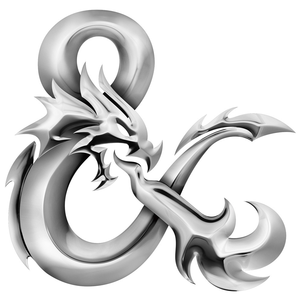
I do have to agree the new ampersand is gorgeous, both plain and chromed but chroming it and putting it in between completely plain red text seems a bit lazy to me. Even when pepsi simplified their logo it had more work put into it.
Maybe they wanted to save on ink? Glitschka studios designed the ampersand, and they did an amazing job, but the in-house design company at Hasbro (the games parent company) designed the rest and put the chrome on the logo.
Though alas my opinion is but one, many people are raving over the changes of the new logo and absolutely adore it, but I'll stop chattering and show you the logo now. The logo will be apart of their 5th Edition prints. Though I still am kind of convinced its a joke.
The ampersand is beautiful I think, though the flat version I think would have gone better with the flag logo, however, who am I to say? The design by Glitschka Studios definitely looks amazing, and Hasbro's in-house team adding the chrome effect, well that's up to you to decide.
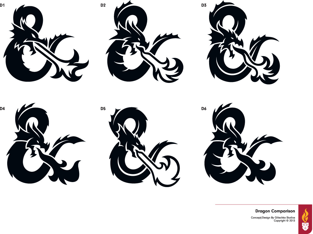
As a bonus, here are the other ideas they floated around at their studios.
Which one is your favorite, do you like the one they went with? And what do you think of Hasbro's in-house teams design?
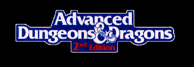
Just for kicks, lets look at some of the old logos for dungeons and dragons.
